Mumbai Rediscovered | Event Brochure
The Opportunity
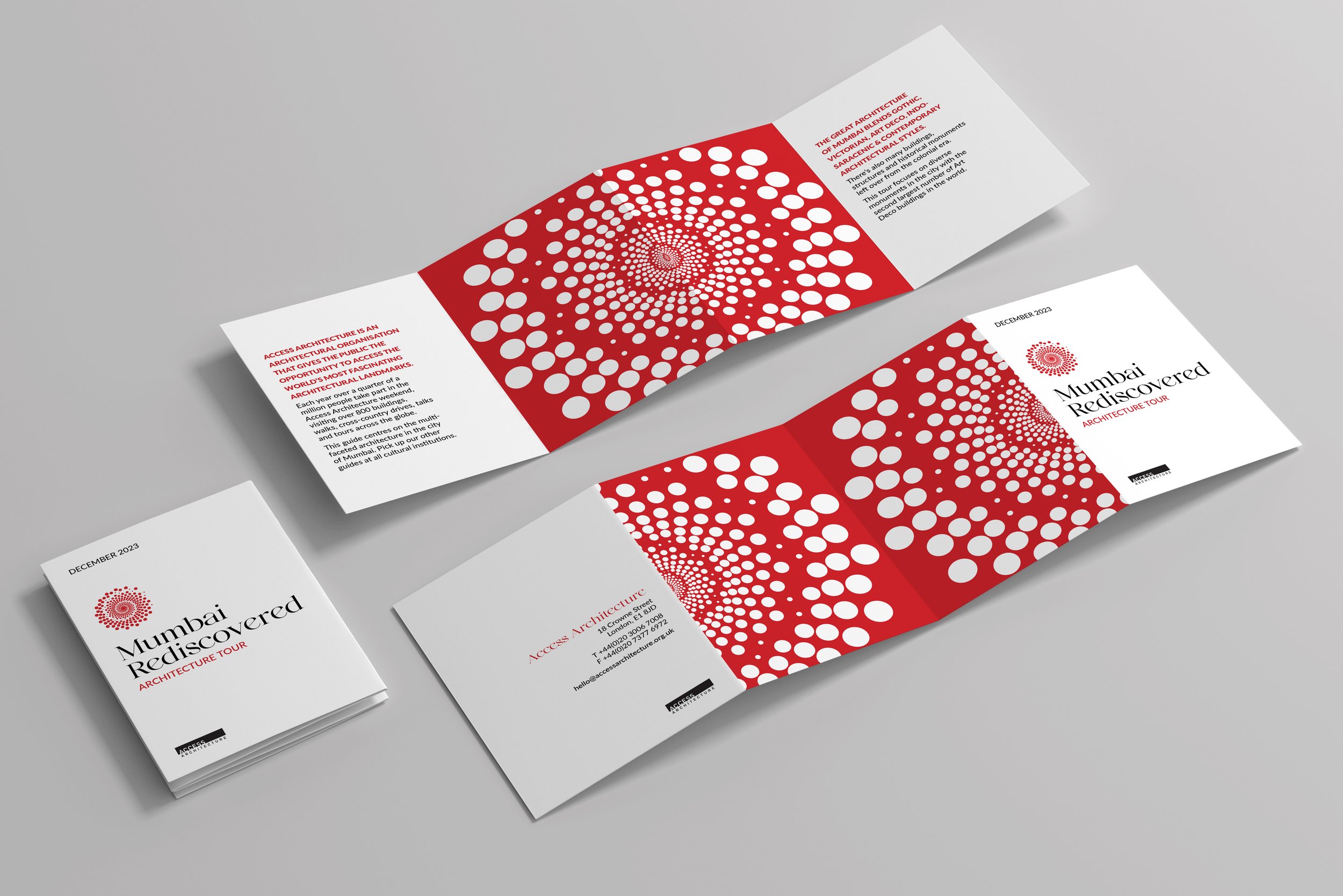
How do you encapsulate the diverse architecture of Mumbai’s most beloved buildings? Access Architecture commissioned a brochure, signage, and gift store items to generate buzz for a once-in-a-lifetime tour of five Mumbai masterpieces.
Proposed Solution
The look and feel for Access Architecture’s Mumbai Rediscovered tour is bold and abstract, meant to attract the gaze of a well-traveled professional or culture connoisseur. Popping out of the inserts of an A5 Concertina fold, the spiral design begs the reader to keep unfolding.
Apart from its dramatic hue, the red color was chosen for its symbolism in Indian culture, where it is associated with love, strength, commitment, and bravery - all characteristics that went into the construction of these sites.
The typography for the lockup uses a modern twist on a classic serif, harkening back to the historical buildings included in the tour. Yet elevated for a sophisticated traveler. The spiral elements extended across the brand are meant to evoke the same feeling of infinite space one would experience while gazing up at Mumbai’s architecture.
This is concept work done at Shillington School of Design.
Keywords // infinite, historical, striking
Tools // Illustrator, InDesign, Photoshop